YONI
Rethinking periods
Did you ever think about what is in your tampons or pads? I did not. Never thought about it, while I have been using them since I was only 13 years old. With no ingredients on the package, it is not that easy to find out.
Until I met Mariah and Wendelien. They told me that most tampons and pads are made of synthetic materials and contain plastic and rayon.
Inspired by their story, Marielle was eager to start soul searching for this new brands identity. Together we grasped the essence of the brand in a brand document. Once we got to know and feel the brand, we focussed on marketing & communication strategy: how can we share this story with everyone?
Wholebrands chose to make the connection to likeminded graphic design agency Thonik. Thonik was Marielle’s partner of choice because of their urge to start triggering dialogues and change the world one great design at the time. We worked on finding a new brand name and creative concept: Yoni.care. In 2 words the story was explained. The word Yoni is Sanskrit for vagina or origin of life. The word not only describes the very subject, it also contains the letter Y, an elemental symbol of female fertility.
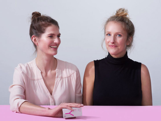
Thonik developed a distinctive packaging design beyond the quality of what competitors offer. Several launch campaigns followed, which featured quotes like, “What’s in the box, is on the box,” and “Chemicals are not for pussies.”
Today, Yoni is a successful social enterprise with a strong and growing reach of women in The Netherlands, Belgium, Luxembourg, France, Germany and the UK rethinking their periods.


